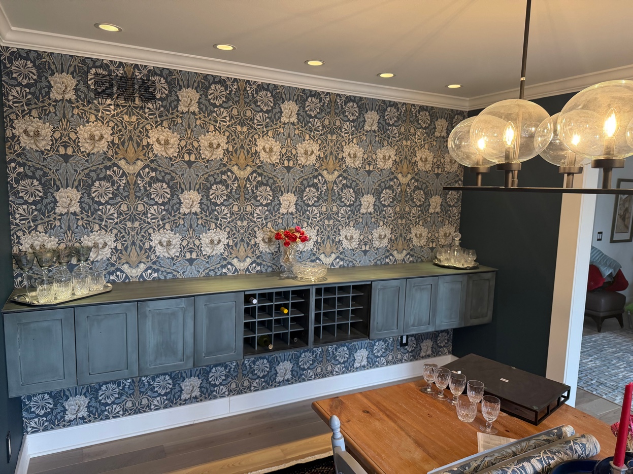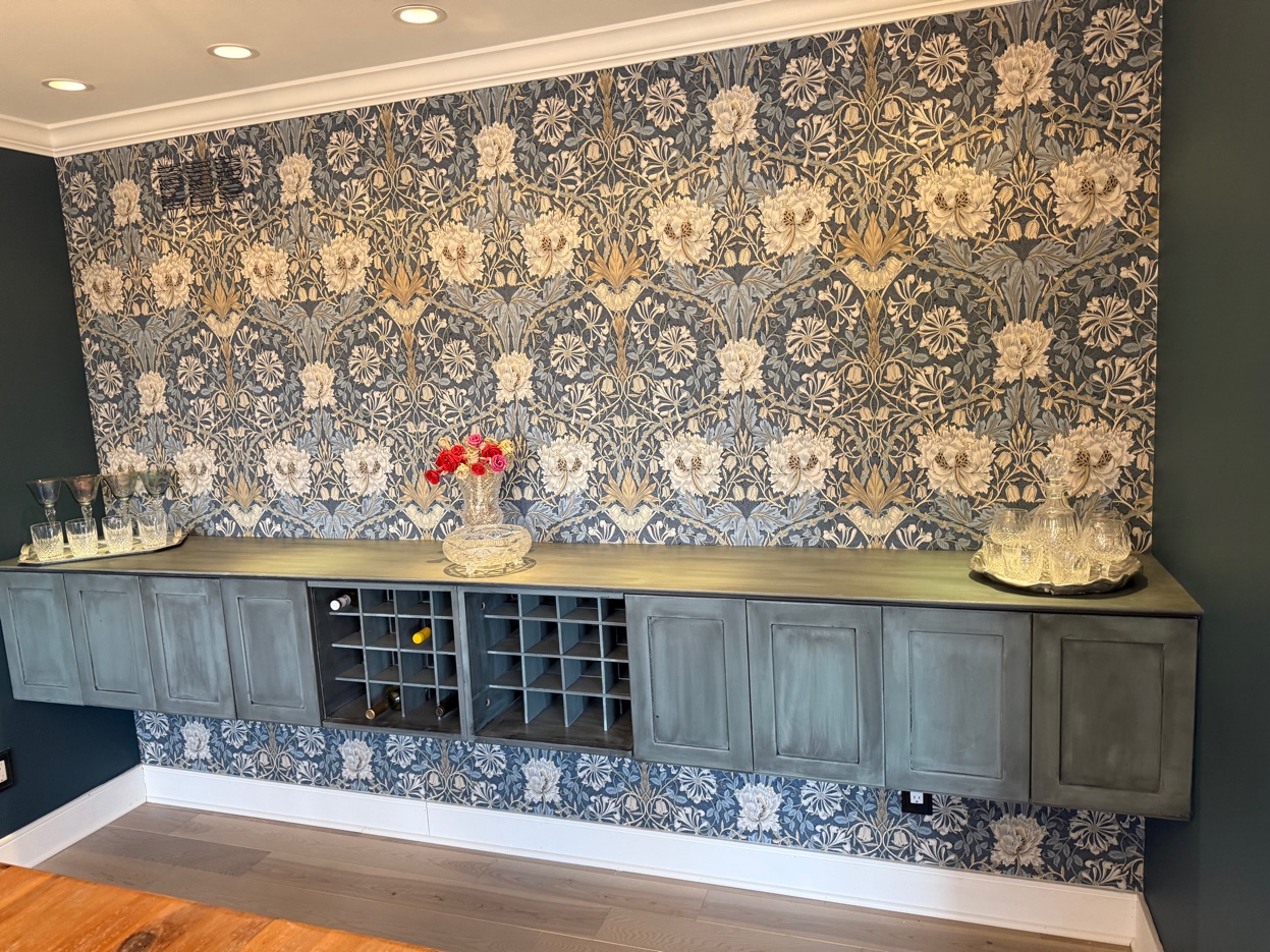
You chose a wallpaper worth doing right. Morris & Co.'s Honeysuckle & Tulip — a William Morris design first drawn in 1876 — turns a wall into the centerpiece of a room. It is also a mirrored, perfectly symmetrical pattern, which means it shows every shortcut. On this dining-room wine bar in Birmingham, the finished wall reads as effortless and balanced. Getting there took a plan made long before the first strip touched the wall, and that plan is the part you are really hiring an experienced installer for.
It begins with the wall, not the wallpaper
Before the paper comes off the roll, the wall gets measured two ways: from the top of the countertop up to the crown molding, since that is the expanse your eye reads, and the full width, corner to corner. Those two numbers drive every decision that follows.
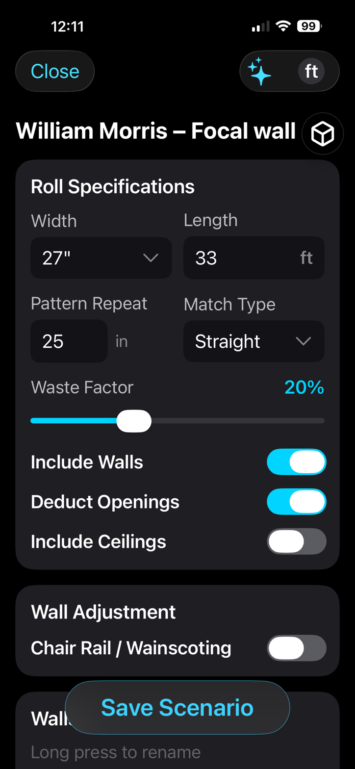
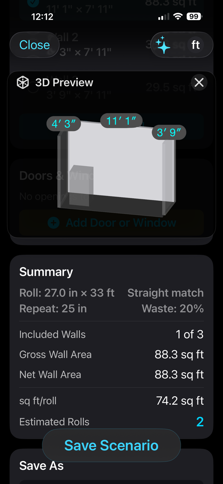
I run the wall through focalScan, the iPhone app I built for exactly this. A quick scan gives the area — about 88 square feet here — and the roll math: Honeysuckle & Tulip comes 27 inches wide and 33 feet long, with a 25-inch straight-match repeat. That works out to two rolls, with enough margin to center the pattern and match every seam. Knowing the repeat up front matters as much as the square footage. It is what heads off the two costliest mistakes on a designer paper: running short on a dye lot that may be gone by the time you reorder, or paying for rolls you never needed.
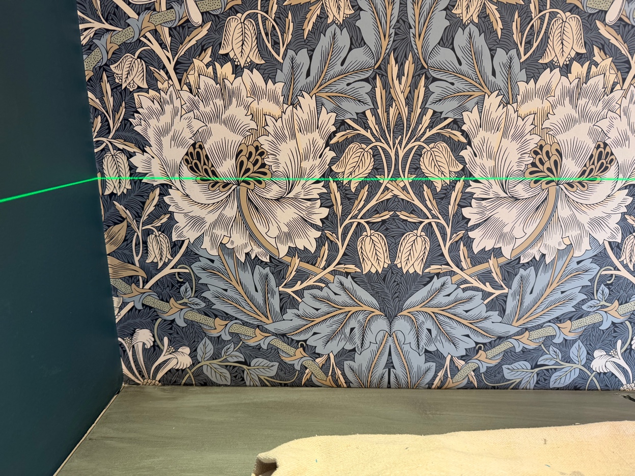
Centering the pattern, not the sheet
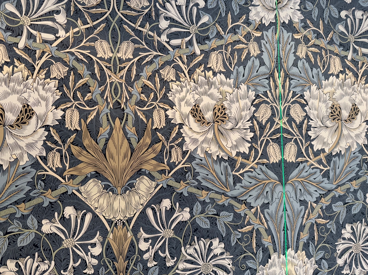
Here is the detail that separates a wall that looks designed from one that looks close. The center of the wall does not get a seam, and it does not get the edge of a strip. It gets the pattern.
A repeat like Honeysuckle & Tulip rarely sits centered on the roll — the large bloom lands wherever the manufacturer printed it. So I find the design's axis of symmetry, the line the whole pattern mirrors around, and set that on the center of the wall. The big bloom runs straight up the middle, and the two halves reflect each other out to both corners.
The center of the wall gets the pattern — not the seam.
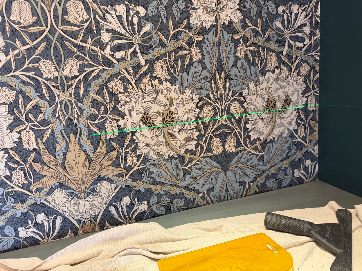
Center a seam instead, and you finish with a full flower on one side of the room and a sliced half on the other. On a paper like this, that is the kind of thing the eye catches every time it enters the room.
Balance, top to bottom and side to side
Because the pattern mirrors left to right, getting that center line right delivers the side-to-side balance on its own — the halves reflect. The vertical placement is the part you set by choosing where the repeat starts, so a full, whole motif reads between the countertop and the crown rather than getting clipped at the molding. It is a small set of decisions, made before anything is hung, that the eye later reads as simply looking right.
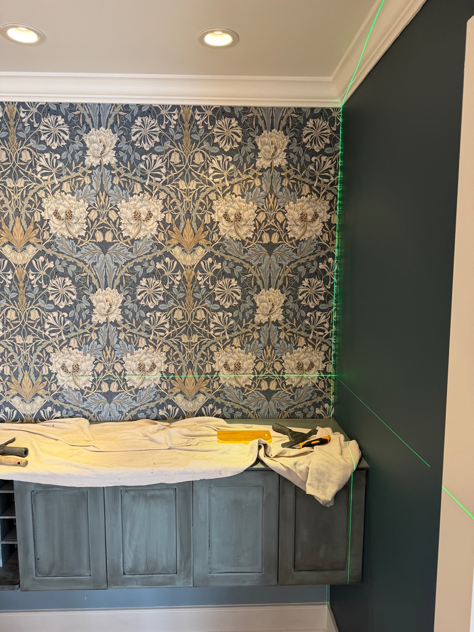
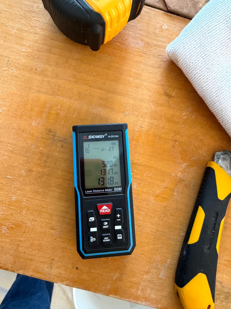
A laser keeps every repeat honest
Once the layout is set, a cross-line laser level holds it true. The green horizontal and vertical lines give a fixed reference right on the wall, so every strip gets checked as it goes up: still centered, still level, the repeat still tracking. A penciled line can drift over a wide wall; the laser holds. On a bold repeat like this one, that constant reference is the difference between close and right.
The details you only notice when they're wrong
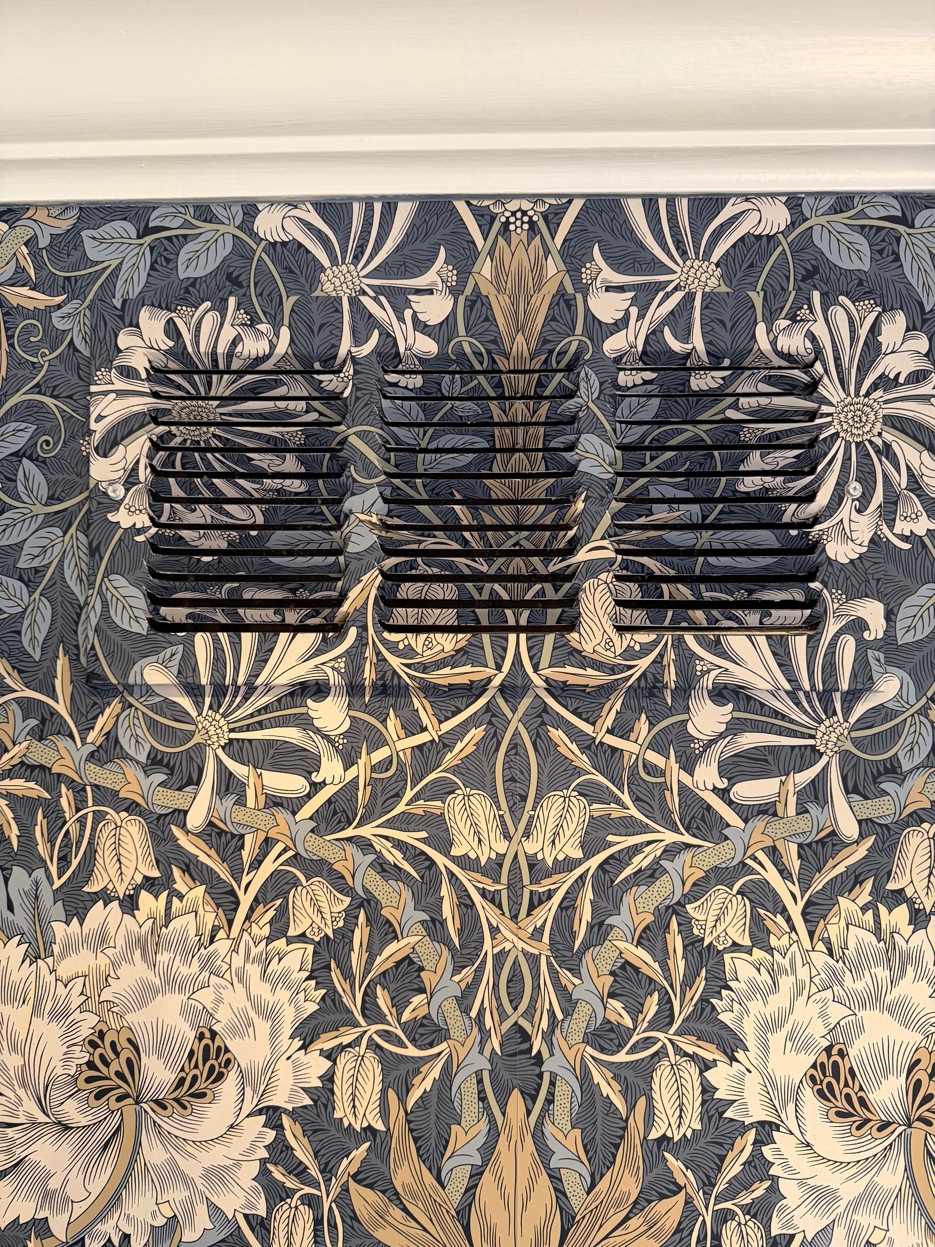
You can see the plan pay off in the small things. The return-air vent is cut and matched into the pattern, so the design carries across it instead of interrupting it. The seams disappear into the foliage. The floating cabinets and wine cubbies sit over a wall where the pattern was laid out to run cleanly behind and around them.
None of it announces itself, and that is the point. A vent that breaks the pattern, or a seam that catches the light, is the kind of thing that quietly cheapens an expensive wall. Done right, you simply never see it.